
Christmas in Colour
- Michael Cattanach
- Aug 30
- 2 min read

Five Colours. One Winter Story.
Christmas is so often dressed in its traditional reds, greens and golds. But sometimes the quieter colours tell an equally beautiful story.
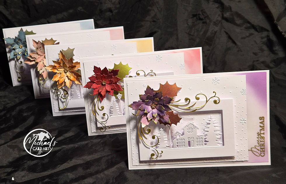
Christmas in Colour began with a simple idea: take a peaceful white Christmas landscape and let just one touch of colour change its personality.
At the heart of each card is the same little winter world — a house nestled amongst snow-covered trees, surrounded by softly falling snow. Almost everything is left white, allowing light, shadow, and dimension to create the landscape rather than relying on colour.
And then, growing across the edge of that quiet scene, comes the poinsettia.
Across the five cards, it changes character — from traditional Christmas red to warm amber and copper, delicate blush, cool winter blue and rich purple. A softly blended panel behind each scene echoes the flower's colour without competing with it, while touches of gold weave through the composition like Christmas ribbon.
Together, the cards remind us that Christmas doesn't have to look exactly the same to feel like Christmas.
Different colours. Different personalities. The same sense of home, warmth and celebration.
Technique Tips
The strength of these cards comes from restraint.
Let white do some of the work. Rather than colouring the house, trees and snow, their definition comes from die-cut detail, embossing, layering and the shadows created between the different levels.
Create a frame within the card. The raised white rectangular aperture immediately draws the eye towards the little house. Because both frame and landscape are white, it creates depth without introducing another competing element.
Use colour asymmetrically. The coloured strip appearing predominantly along the right-hand edge is particularly effective. It gives the card colour without turning the entire background into a coloured panel.
Echo rather than match. The background wash relates to the poinsettia but doesn't need to reproduce its exact colour. Keeping the background softer allows the dimensional flower to remain the focal point.
Build the poinsettia from the centre outward. Shape and slightly curl individual petals before assembling them. Varying their angle is what gives the flower its wonderfully natural, almost sculptural appearance.
Use tonal variation within one flower. Your purple card demonstrates this especially well. Moving from deep plum through violet into softer lavender creates much more depth than colouring every petal identically.
Gold works best as punctuation. The fine gold edging, flower centre, scrolling foliage and sentiment provide small flashes of reflected light. Because gold isn't everywhere, every little glimpse of it feels deliberate.
Think about visual movement. The poinsettia anchors the upper-left portion of the composition, while the sweeping gold flourishes lead the eye across the card, down into the winter scene and eventually towards the Christmas sentiment.


Comments