
Whispers in the Treetops
- Michael Cattanach
- Jun 17
- 4 min read

Updated: Jun 29
Project Highlight:
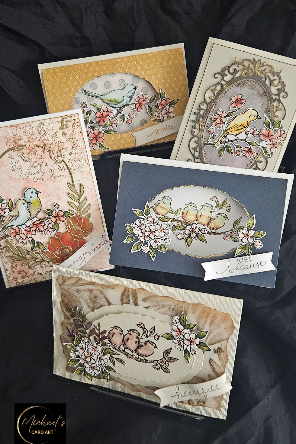
There is something timeless about birds perched amongst flowering branches. They evoke quiet mornings, gentle conversations, and those small moments of connection that often become our most treasured memories.
This collection of five artisan greeting cards explores that theme through soft colour palettes, delicate floral elements, and carefully layered focal images. While each card stands beautifully on its own, together they tell a cohesive story of friendship, encouragement, gratitude, and heartfelt connection.
One aspect I particularly enjoyed while creating this series was balancing softness with detail. The birds are coloured using subtle blends rather than bold contrasts, allowing them to sit naturally amongst the blossoms and foliage. Gold accents, textured backgrounds, and layered die-cut frames introduce elegance without overpowering the focal images.
You'll notice that each card approaches composition differently. Some designs use ornate framing to create a more formal presentation, while others rely on open space and simple layering to achieve a calm and contemporary feel. Despite these differences, the repeated use of floral branches, soft pink blossoms, and muted earthy tones creates a visual thread that ties the collection together.
The sentiments—Smile, Just Because, Heartfelt, and Cherished Friend—were chosen intentionally. They reflect the idea that handmade cards need not always mark a major occasion. Sometimes, the most meaningful cards are those sent simply to remind someone they are valued and remembered.
This collection also demonstrates how a single stamp set or focal image can be interpreted in multiple ways. By changing the background treatments, framing elements, colour placement, and card layouts, it becomes possible to create an entire coordinated collection without any two cards feeling repetitive.
For card makers, this approach offers wonderful value from your supplies while also encouraging creative exploration. Rather than reaching for a new stamp set, challenge yourself to see how many different stories you can tell with the one already on your desk.
Technique Tip: Creating Cohesion Across a Card Collection
One of the easiest ways to elevate a group of handmade cards is to create a cohesive visual theme.

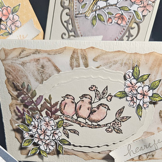



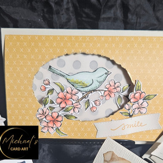
For this collection, cohesion was achieved through three key design choices:
1. Establish a Consistent Colour Palette
Rather than selecting colours independently for each card, begin by choosing three to five colours that will appear throughout the collection.
Here, soft blush pinks, muted greens, warm neutrals, and touches of gold create harmony across all five designs. Even though the backgrounds vary significantly, the repeated colours help the eye recognise them as part of the same collection.
Tip: Lay all coloured elements side by side before assembling the cards. This makes it easier to identify colours that feel out of place.
2. Repeat Key Design Elements
A collection becomes visually stronger when certain elements are repeated.
In this series, those repeated elements include:
Birds as the focal image
Flowering branches
Soft pink blossoms
Oval and vignette-style framing
Fine gold accents
These recurring features provide continuity while allowing each design to maintain its own personality.
Tip: Aim to repeat at least three visual elements across every card in a collection.
3. Vary the Layout, Not the Theme
The temptation when creating a collection is to make every card identical. Instead, keep the theme consistent while varying the layout.
Notice how:
One card uses an ornate die-cut frame.
Another relies on a simple oval opening.
One incorporates vintage script and collage elements.
Others embrace clean and uncluttered compositions.
The result is a collection that feels coordinated rather than duplicated.
Tip: Think of your cards as members of the same family. They should share similar characteristics, but each should have its own distinct personality.
And…Something else I wanted to add
Let White Space Breathe
It can be tempting to fill every corner of a card, especially when working with beautiful stamps and dies.
But notice the blue card with the quartet of birds.
The generous space surrounding the image allows the eye to rest. The sentiment Just Because feels calm and intentional because it isn't competing with other elements.
Tip: White space—or in this case, coloured space—isn't empty. It's breathing room.
And sometimes, that's exactly what a design needs.
From My Desk
When I sit down to create, I rarely know exactly where a project will end up. What begins as a single coloured image often grows into a collection of ideas. This series was one such project.
As each card emerged, I found myself drawn to softer colours, flowering branches, and the gentle presence of birds. By the time the fifth card was complete, I realised they belonged together—not as individual designs, but as a small collection celebrating friendship, kindness, and the simple joy of sending a handmade card.
After all, some messages don't need a special occasion.
Sometimes a card is sent just because.
Until Next Time
Michael
Michael's Card Art
---------------------------------------

Did This Project Catch Your Eye?
If you'd like to own the finished artwork, this featured design is available as a:
✦ Gift Box Stationery Gift Set – A beautifully handcrafted collection of matching cards and envelopes, ready to enjoy or gift.
Visit the Shop to see what's available and discover more handcrafted collections from Michael's Card Art.


Comments